San Diego Graphic Tee Design
Cities each have their own unique personality. I should know – I’ve lived in a lot of them.
First batter up is my hometown of San Diego.
San Diego is a laid-back place. We love to be outside, eat good food, and if any of these activities take place in proximity to the ocean, our happiness level goes way up.
And we love our graphic tees. More than any other city design I do, this one needs to look like it could go on a tee-shirt or hoodie.
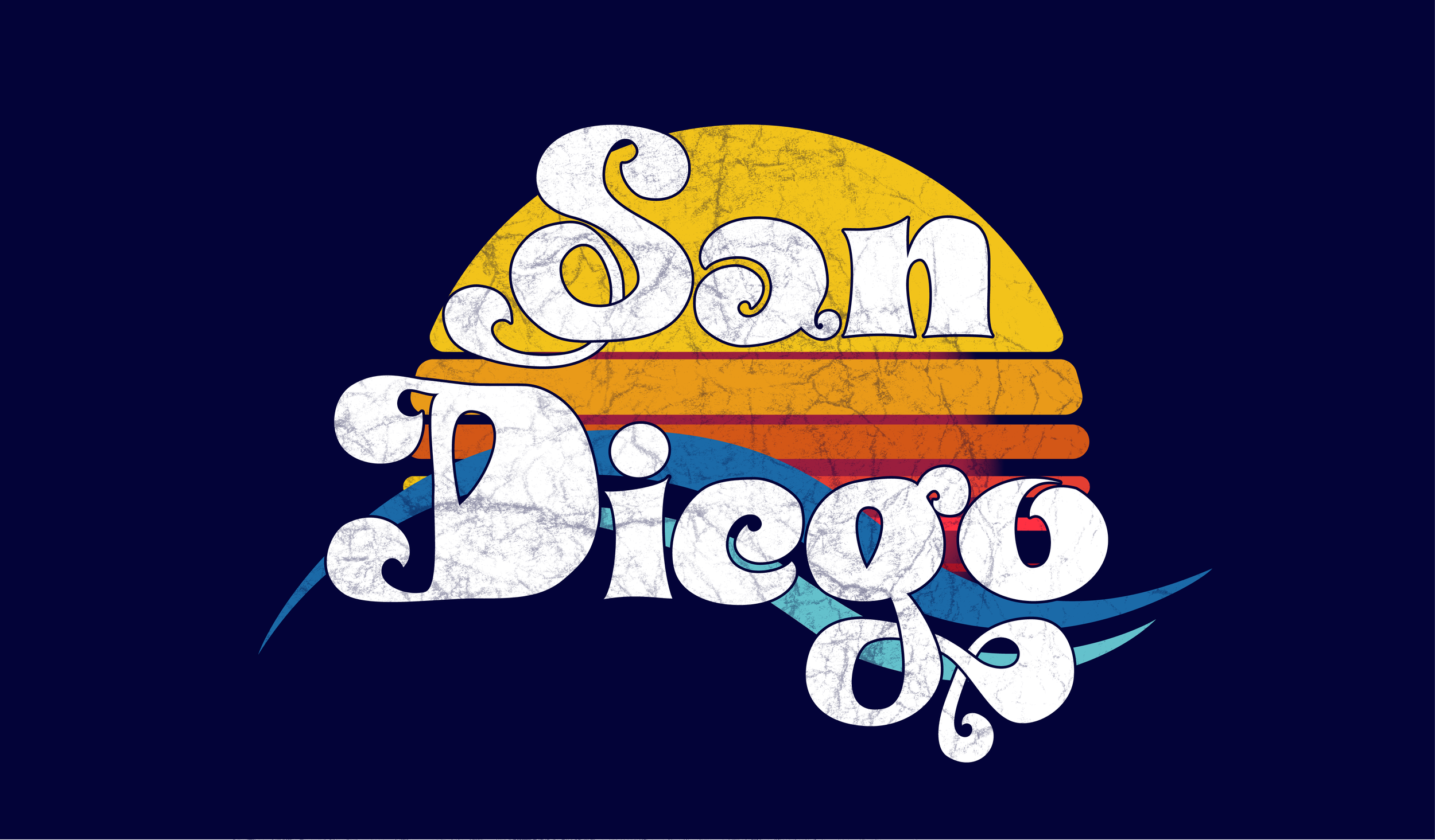
I lived here as a child, and a lot of my memories from here are from the 80s, so I wanted to give my San Diego script a vintage, beachy feel.
I found a reference font with lots of over-sized loops, and a fun, California attitude, and I sat down with my pencil and a sketch pad.
I went through a few drafts of different letters. In the end, it was the “g” I fell in love with, and I kept coming back to that letter as my strongest stylistic reference when modifying the other letters.

I photographed the hand sketch and brought it into my iPad, where I started tracing and cleaning up the letters in Illustrator to clean it up more before bringing in a reference font to work out sizing and spacing.
I used to do letterpress by hand, with lead type, so I’m pretty comfortable lining up my typeface myself, but things are always cleaner if you have a font reference.
Letters with curves sit below the baseline for the other letters. While the curve of the “a” and the “o” sit nicely below the baseline, I didn’t think the “e” was deep enough, so I lowered it.
I gave the “S” a lot more heft, and simplified my “D” as I wasn’t liking the spiral design. It was a bit more Burton than Benoa.
To get the “e” right, I turned the “a” upside-down and edited it.
I made an effort to bring the ocean into the letters.
I wanted a graphic to sit behind it of a sun setting over the ocean, and I wanted to bring in that 70s/80s style again.
After a few false starts, I had my sun. I started with a circle and divided it using rectangles in increasing ratios of 1.618 – because why would you not use the golden ratio?
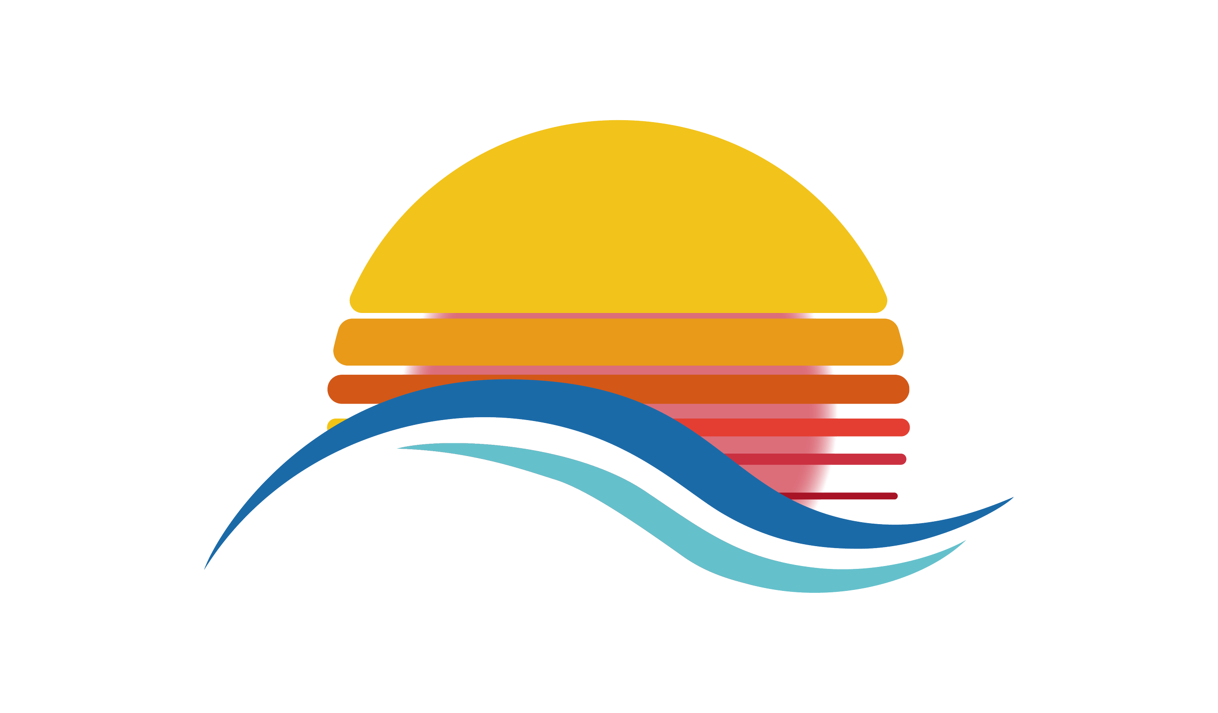
I gave it a feathered, transparent glow behind the divided circle, and bisected it all by two ocean waves.
I didn’t like the way the outline didn’t connect on the “S” and the “g”, making them look like one merged shape rather than loops overlapping themselves, so I decided to create those divisions by hand.
The blue of the waves was also far too subtle, so I needed to brighten those up.

To finish it off, I added a grunge texture to distress the graphic a little and make it look more like it would on fabric after years of wear, or just for a stylish textured first printing.
Stay tuned for the next design! Maybe your city will be next!