Oh Olive Oil
Oh Olive Oil is a new brand by Ohanneson Enterprises, a family farm in the San Joaquin Valley.
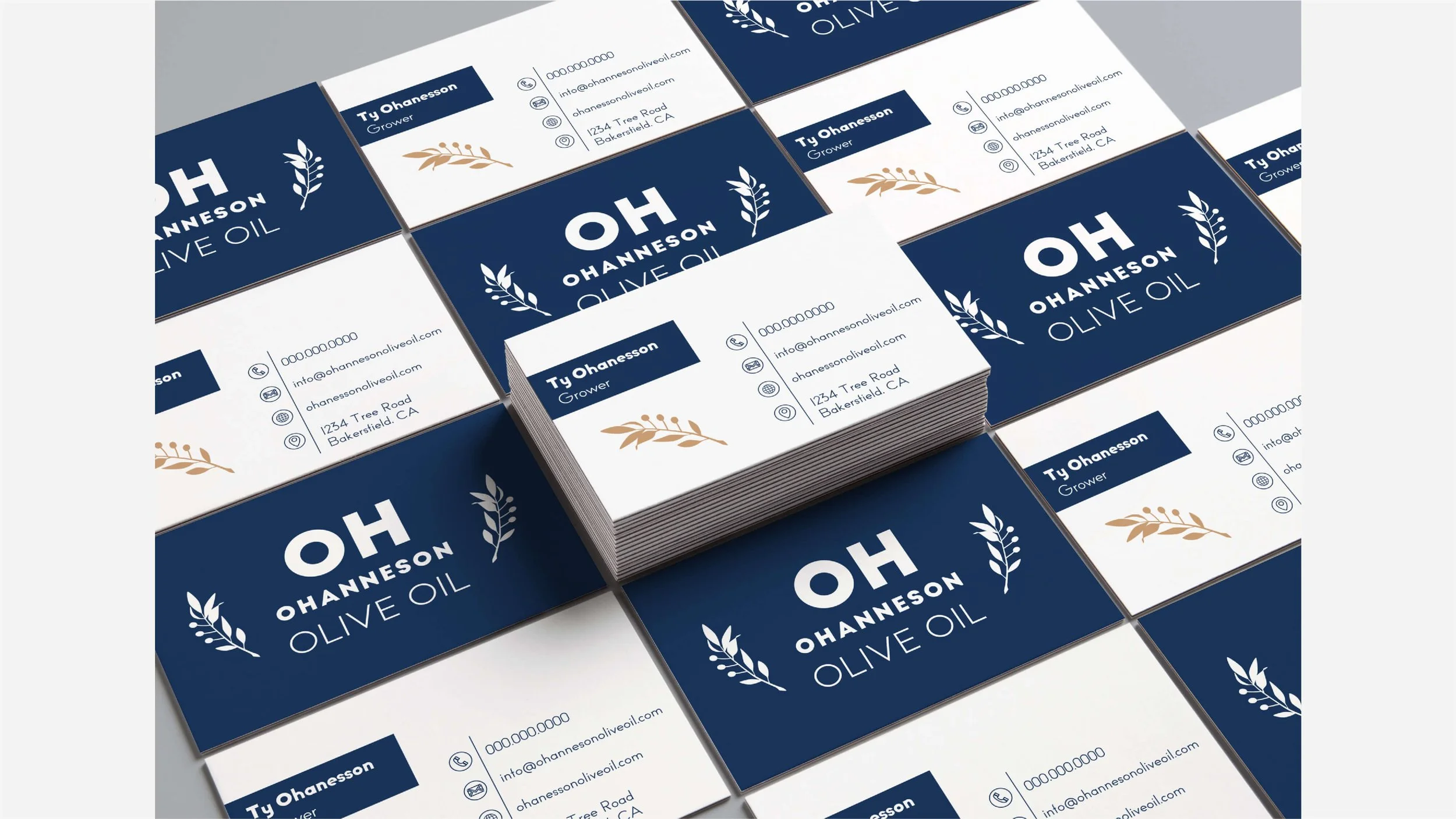
Because the label was the center-point of the new brand, I set initial drafts of logos on a label. This allowed me to work with additional visual elements right from the start. Both the client and I were very focused on how the bottle would look on the shelf. I don’t think the logo we settled on would have stood out so well had I not organized the project this way.
Focusing on product design rather than logo design allowed us to see the whole picture. The logo we settled on makes the brand recognizable – and is easier to spell than Ohanneson Olive Oil, which made for a simple URL: www.oholiveoil.com.
For both the logo and the label, white space was a big part of the final design, so I emphasized the sizing of negative space over positive and used the golden ratio to balance the spaces between the text, making a logo and a label that breathe and feel very open and clean.