Logo vs. Mascott
Your logo is your brand’s first impression. It speaks for you before you do.
What’s the difference between a logo and a mascot? Between a logomark and a logotype? What role do other visual elements play in creating your brand identity?
When A Logo Is A Logotype
A logotype (also called a wordmark) is a text version of a logo. It can be either the complete logo in its entirety, or a portion of it simplified for certain situations.
It’s the branded name of the company, just as readable scaled up on the side of a building as it is shrunk down to fit on a business card.

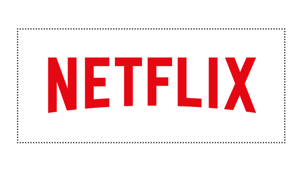

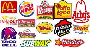
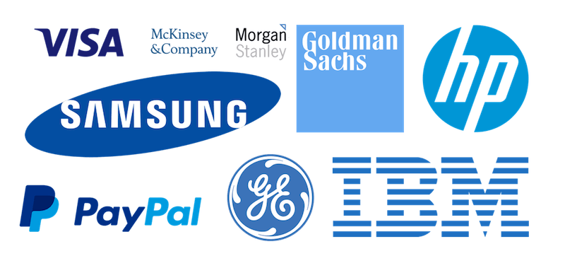
Disney, HBO, and Netflix are three organizations that use only a logotype as their principle and only logo. Other notable companies like IBM, Sony, and FedEx are in the same camp. They don’t have a separate graphic. For these brands, their name says it all.
Custom fonts are sometimes developed for professional logotypes. This creates a visual iconography customers will quickly recognize, and has the added benefit of making a logo more difficult to counterfeit.
Existing typefaces can be used as-is in the U.S. to create a logo without crediting the initial font designer, though laws differ country-to-country. In the UK, a creator of a typeface has more control over how their fonts are used and graphic designers do not have the same freedom to take on any typeface they fancy.
And When It Isn’t
There are companies that have a wordmark that we’re accustomed to seeing along with a more illustrative logo. Never-the-less, their logotypes can stand alone, unique and immediately recognizable.
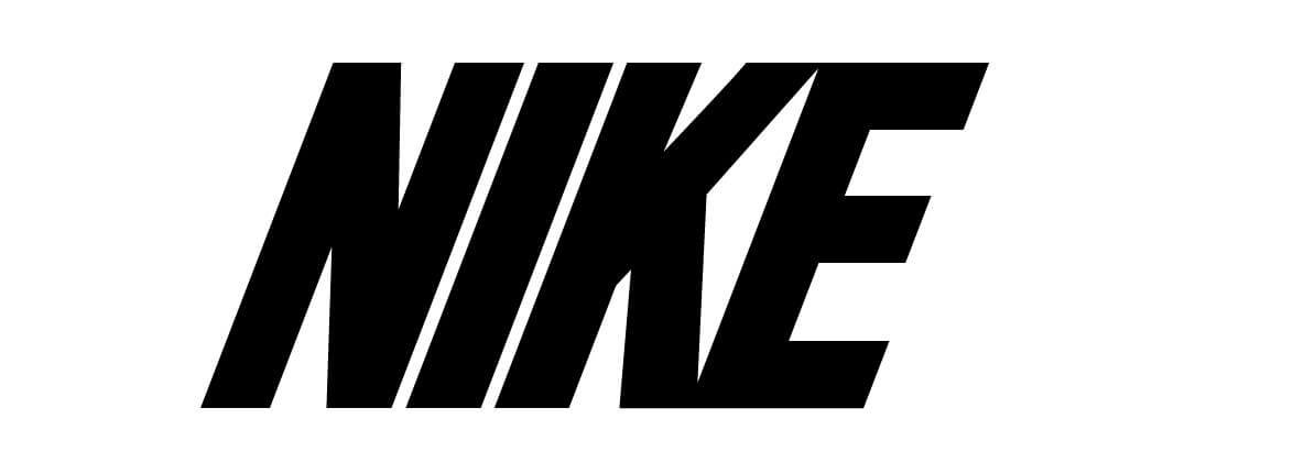
Nike, WordPress, and Adidas are all brands that have an additional component to their logos, referred to as a logomark.
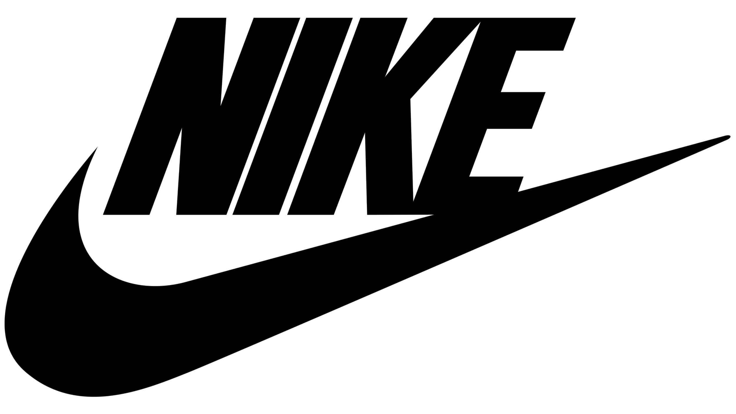
When you get a logo designed, expect to see variations like this for different usages and spaces packaged up for your use in different contexts.
Other Visual Elements
So where do other pieces like mascots, visual elements, and colors fit into all this?
Mascots
Mascots are fun but need to be a good fit for your brand. Although they can be cartoonish, they’re not just for kids’ brands, though it does help to have a little bit of levity woven in to your marketing strategy.
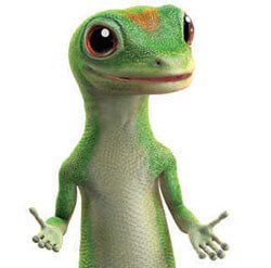

Mascots are a type of spokesman, able to lighten the delivery of a flat message, and engage with your customer base in a way that feels approachable.
They can add humor and memorability to your brand identity, and help to focus a marketing strategy. Mascots can be as memorable as a logo and when brands step away from a long-time mascot, their departure can be a significant event.
Visual Elements
Elements like the Disney Castle, Christian Louboutin’s red soles, and a stormtrooper silhouette can appear out of context, in the real world, and remind fans of a familiar brand.

To those who recognize them, these can feel like a wink – a shoutout to those in the in-crowd. Disney has cultivated a phenomenon out of this, and promotes “Hidden Mickeys” in their films, theme park rides, and even holiday confectionary.
Other visual elements can be added to general branding, like a curve on stationary to reinforce brand colors, rings on social icons, or flowers on an invitation. These will be repeated across all collateral – business cards, stationary, websites, and T-shirts.
These visual cues put a logo in context, and pull a brand identity together.
Colors and Gradients
Colors are the final touch. Of course icons and mascots can tip their hat to the industry a brand belongs to, but colors can more directly point to business type.
A tech company using red and yellow could look out of joint, as could a food company using shades of blue. We’re accustomed to seeing not just brands, but entire industries, painted with a certain brush.
Effective Branding Is Iconographic
Effective branding is so recognizable it can be spotted even when manipulated. We get comfortable with a familiar brand, and in the shouting sea of Western capitalism, they can feel like touchstones.


Your customers will look for your branding when they’re looking for you. Branding is bigger than just a logo, just a website. It’s a complete package people can spot from a distance.
The right branding should feel like a good fit, the way your business does, and be uniquely you.